Making data simple and powerful for user-led organisations
Last year we held a competition to celebrate how open grants data can be visualised.
In this latest in a series of interviews with the competition winners, Victòria Oliveres answers questions about her From Funder to User data visualisation.
The judging panel awarded Victòria second prize, saying that her visualisation was a beautiful combination of simplicity and power.

What inspired you to create the visualisation?
Firstly it was a way to challenge myself to work with a topic, data type and visualisation language that I hadn’t used before. 360Giving has created a huge shared dataset that, if analysed with care and visualised attractively and simply, can help grantmakers improve their good work.
Plus I wanted to build a bridge between the data and the public.
Describe your visualisation?
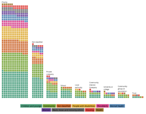
As I am a data journalist, I created a long-form article with a series of data visualisations that map grants to user-led organisations. They also answer visually some of the questions we might have about grants, such as which topics receive the most, the type of recipients and which are the biggest funders.
The basic idea was to assign each grant a square, and to colour, size, order and classify the squares in different ways.
What stories does your visualisation tell?
The charts show data at different levels. At first sight the viewer sees the number of grants given. In a second level we can see which themes, organisations and funders receive or give more. And finally, the most detailed level is about individual grants when you hover over the squares.
 How have you created the visualisation?
I focused on user-led organisations which is not a type that the data records, so I first had to use code to filter the grants.
Using the programming language R, I cleaned, filtered and analysed the data based on the description of the grant and organisation. I considered the types of group likely to set up organisations with activities, services and programmes planned and used by themselves: communities and residents, patients, young people, older people, volunteers, children, parents and families, women, disabled people, students, BAME people, asylum seekers, violence survivors and ex-offenders.
Another big part of the analysis was categorising the grants in themes and assigning a type for each organisation. As this is not provided as a variable in the dataset, I used text-analysis techniques. The code is in this Github repository.
When the data was ready, the charts were created using the javascript library D3.js and CSS Flexbox. This language allows custom and responsive visualisations. I have also included tooltips to allow the viewer to find out more about each grant. The code can be found here.
How do you hope your visualisation might be helpful to the giving sector?
I hope that by making the data more accessible it will inspire more user-led organisations to apply for grants to develop projects.
From Funder to User is also a transparency and accountability tool, helping anyone understand trends in grantmaking and which projects and organisations received grants and their value.
Thank you Victòria!
