Winning at visualisation and improving society
Last year we held a Challenge Fund competition to celebrate how open grants data can be visualised.
In this first of a series of interviews with the competition winners, top prize winner Xavi Giménez answers questions about his Grantmaking Themes visualisation.
The judging panel awarded first prize to Xavi’s work as it allows users to leap right into the detail of the 360Giving dataset to understand what’s been funded.
Why were you inspired to create the visualisation?
The main motivation to participate started with supporting the mission of 360Giving: to do as much good as possible with funding.
It was a gratifying and meaningful opportunity to provide a data-driven, evidence-based tool to help grantmakers and others improve their activities.
Describe your visualisation?
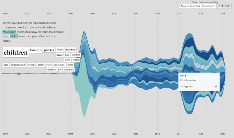
The visualisation tackles a specific question set by the challenge: “Who has funded what over the years?”. I’m not an expert in the field, so I wanted to provide a data visualisation that reveals the ‘big picture’ of the grantmaking activity and at the same time to catch the interest of the user and enable them to drill down to get more detail.
A good data visualisation has to maintain a balance between offering a pleasant, eye-candy interface and being consistent and informative. I had this in mind while I was coming up with ideas and developing this exploratory tool.
How have you created the visualisation and what stories does it tell?
Behind the visualisation is data generated by Natural Language Processing algorithms.
Basically, all the grants contained in the 360Giving dataset were analysed to reveal themes, so we automatically discover the hidden thematic structure in a dataset that describes all the grantmaking activity since 1998. This leads to a lot of new information that is highly revealing.
Think of a theme as a collection of terms that tend to appear together in the descriptions of the grants. The visualisation shows how these themes have evolved over the last 20 years, uncovering trends that are always present through the period, or themes that are gaining or losing interest. This gives grantmakers a historical context about what was funded in the past and what is being funded now.
 The visualisation enables you to select a theme and see information about it’s highest funders and more granular data about the individual grants. As it’s important that data visualisations offer more than a single entry point to reveal useful information, this tool allows users to search by a specific organisation and reveal their grantmaking footprint per theme.
How do you hope your visualisation will help grantmakers?
I hope it will give funders a historical vision of all the grantmaking activity, helping to provide more context when making funding decisions.
It’s important to me to raise awareness of how using data is crucial to evidence-based insights. Through techniques like data visualisation and machine learning algorithms we can go beyond the data and generate new knowledge that can be more easily understood.

