Visualisation Challenge judging panel confirmed
Between April and July 2018 we ran a Visualisation Challenge where we asked people to submit their responses to two questions:
- Who has funded what themes throughout the years?
- User-led organisations: Who funds them, in what thematic area, how much funding do they receive and what type of organisation are they?
The entries had to use 360Giving data in order to qualify. We received 35 submissions from all over the world, and we got to see many different takes on the 360Giving dataset and how it can be used. Now the time has come to judge the submissions and reward our winners.
We wanted to work with a diverse group of experts to help us spot the most creative visualisations. We are excited to have brought together four great panellists to work with our co-founder and trustee, Will Perrin, to help us judge the winning entries. The panellists are:

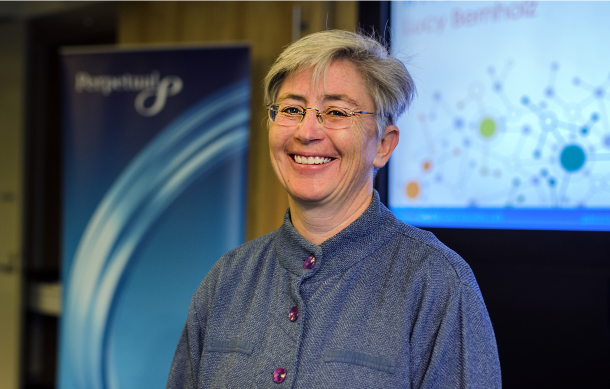
Lucy Bernholz (@p2173) is a Senior Research Scholar at Stanford University’s Center on Philanthropy and Civil Society and Director of the Digital Civil Society Lab. She is the author of numerous articles and books, including the annual Blueprint Series on Philanthropy and the Social Economy, the 2010 publication Disrupting Philanthropy, and her 2004 book Creating Philanthropic Capital Markets: The Deliberate Evolution. She is a co-editor of Philanthropy in Democratic Societies, published in 2016. Lucy writes extensively on philanthropy, technology and policy on her award-winning blog, philanthropy2173.com.

Anna Powell-Smith (@darkgreener) is Chief Product Officer at Flourish, the platform for data visualisation and storytelling. Before Flourish, Anna spent a decade as a freelance data visualisation developer and worked on data journalism projects with Private Eye and Greenpeace. She was also technical director at Oxford University’s Evidence-Based Medicine Data Lab working on projects to improve medicine with evidence and data. In her spare time, she helps map land ownership at Who Owns England.
 Eric Rodenbeck(@ericrodenbeck) founded Stamen Design in 2001 and since then has served as the organisation’s Creative Director. Stamen is an internationally recognised data visualisation design studio based in San Francisco, California. Stamen develop projects for a broad range of national and international clients including National Geographic, the Audubon Society and the Dalai Lama. The studio is recognised as having helped to define the emerging medium of interactive data visualisation and online cartography. The work is in the collections of the Museum of Modern Art in New York City and the Victoria and Albert Museum in London. At the Information is beautiful Awards 2012, Stamen won the Gold Award for data Journalism and the Most beautiful award for its “Home & Away” project for CNN.

Alan Smith (@theboysmithy) is Data Visualisation Editor at the Financial Times. Previously a civil servant, he created the Data Visualisation Centre at the UK Office for National Statistics and was awarded an OBE for services to Official Statistics in the 2011 Queen’s Birthday Honours list. A geographer/cartographer by background, Alan’s TEDx talk Why you should love statistics was a featured talk on TED.com in 2017.
 The judging panel will be led by 360Giving co-founder and trustee, Will Perrin (@willperrin). Will is also trustee of the Indigo Trust, Good Things Foundation, The Philanthropy Workshop and Carnegie UK Trust. His original work in the UK Cabinet Office in 2006-7 kicked off the British government interest in open data. He has since held several public appointments on open data and is a regular commentator and practitioner in putting open data to work on social issues.
To see all the submissions to the Visualisation Challenge visit: https://www.threesixtygiving.org/data-visualisation-challenge/. The three winners will be announced at an event on 21st September in London. For more details and to sign up to attend, visit our eventbrite page.
